
The Google Telephone application is evolving to allow its users to more easily find their favorite contacts. All in a revised and corrected design.
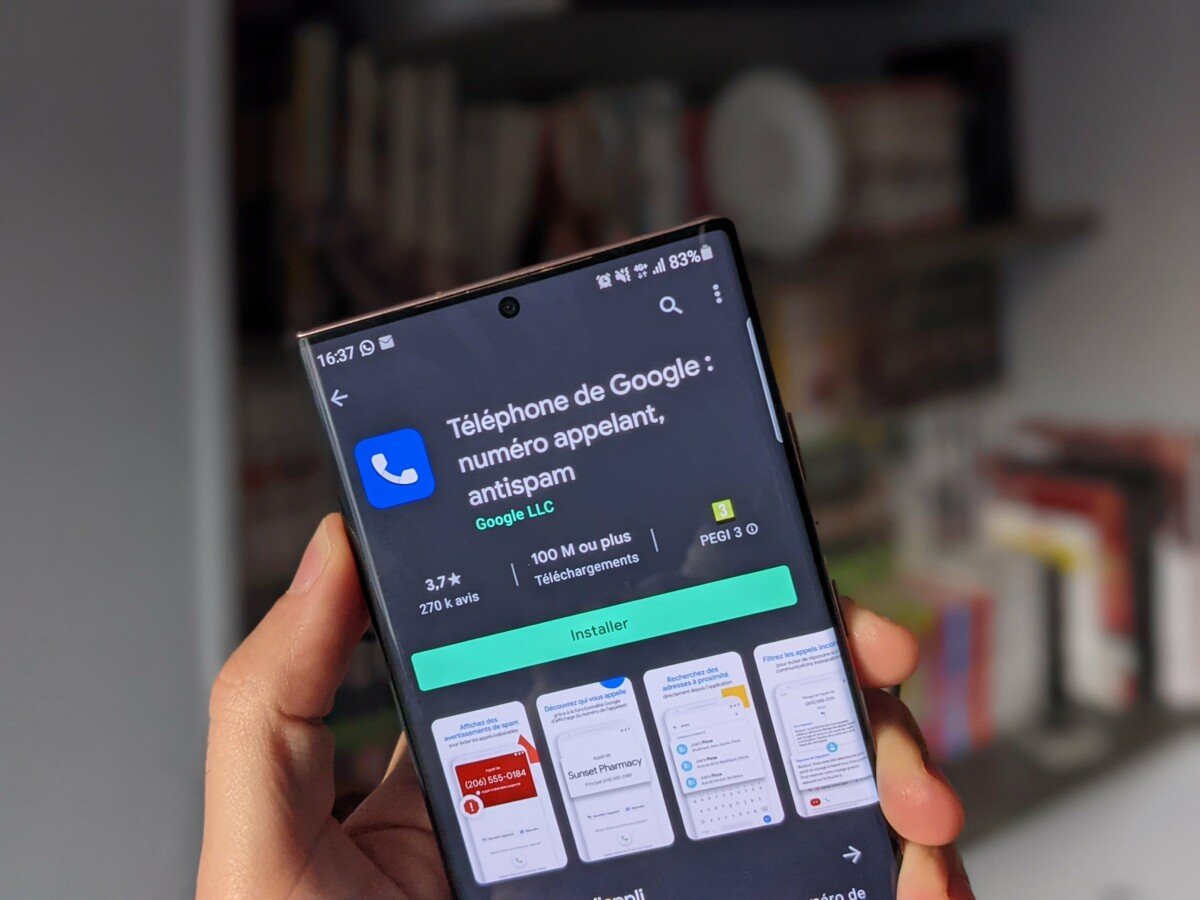
Google continues to modernize its applications. After unveiling its new expressive Material 3 interface, it is the set of applications of the American giant that gradually adopt this design thought to “emotionally” reach its users. The latest being the phone application that accompanies this visual overhaul of three technical changes, indicates Android Police.
A new interface
The new interface allows a quick glance to access his favorite contacts. The latter appear in a dedicated category at the top of the interface from the “recent” tab. The upper menu, it now allows Filter calls by type. Users can now access all of their calls, their missed calls, all contacts or spam and non-spam.

To go further
Tired of unwanted calls? Google improves the smartphone
The display of contact photos now appears in a rounded and wavy form respecting the visual identity of Material 3 expressive and the buttons during a call are now larger.
A new way of responding
The other major change in this version concerns The way of responding to calls. The old vertical scan leaves its place to un balayage horizontal. A change that would allow users not to drop their calls simply by leaving their smartphones from their pockets, specifies Google. Another option allows users to change this system to switch to a simpler interface requiring only to press buttons, indicates Android Police.
Formerly reserved for beta testers, this new interface would begin to be more widely deployed to all users.